Less is better.
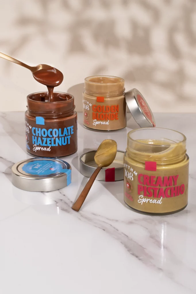
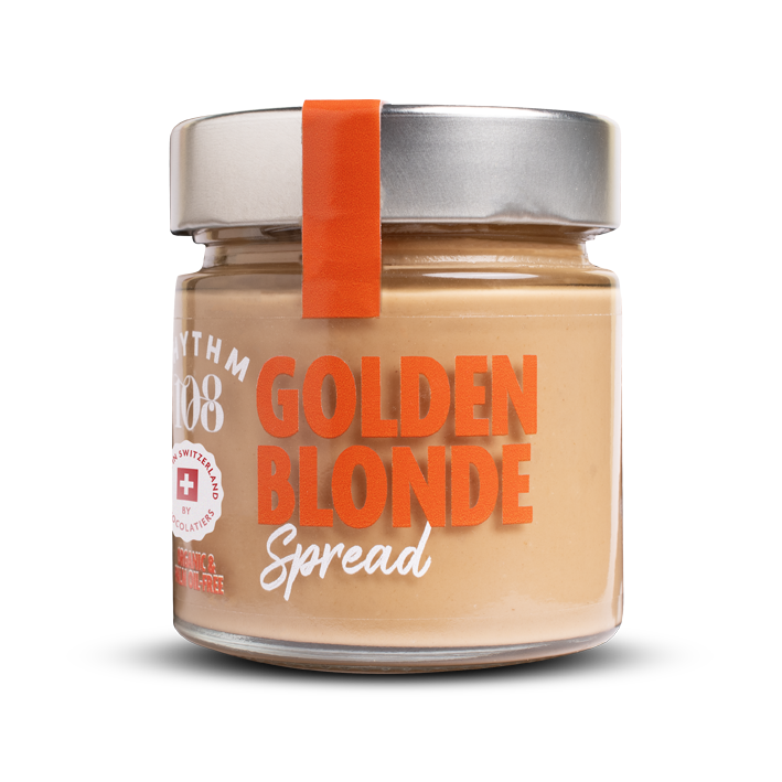
A clear compostable label.
The launch of these new products made Rhythm 108 wonder how to be competitive and remarkable in shelves.
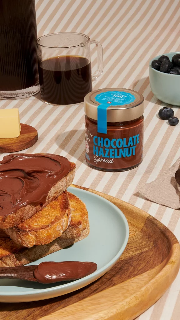
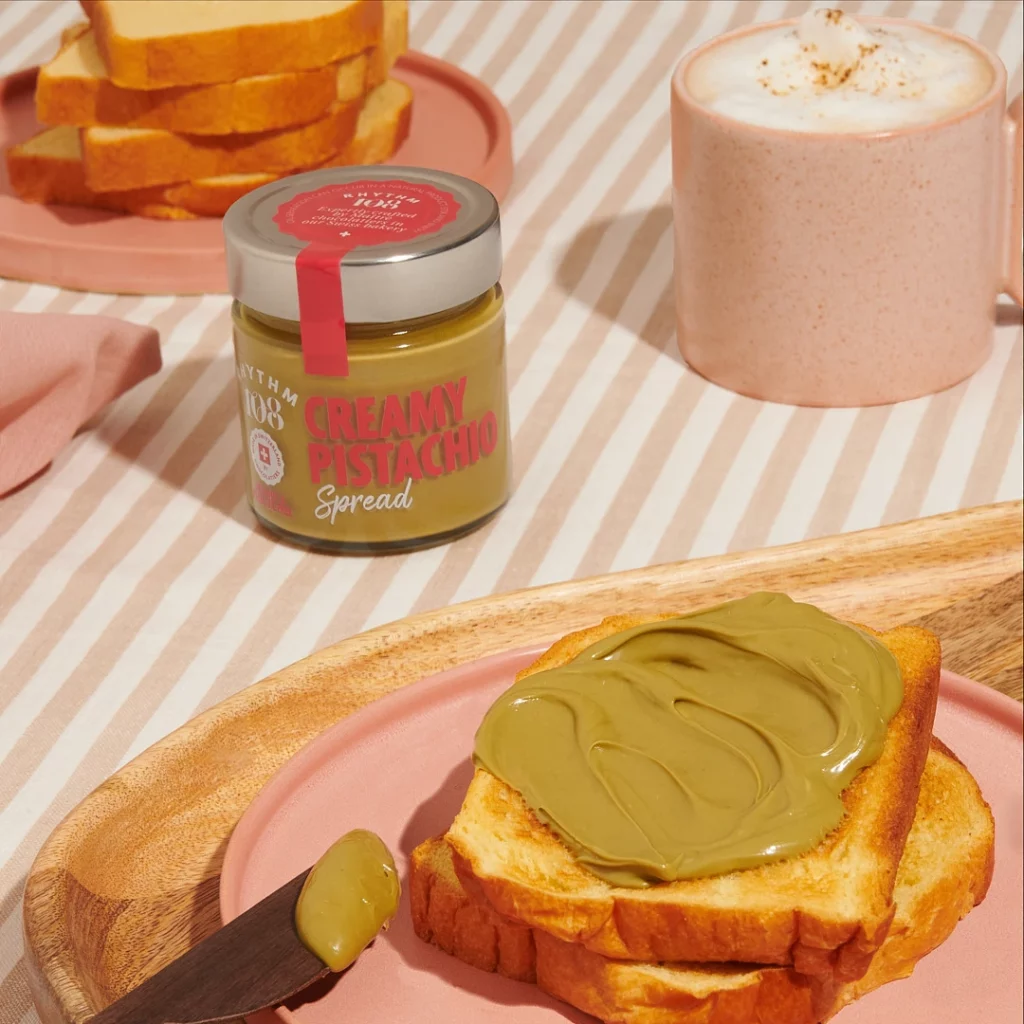
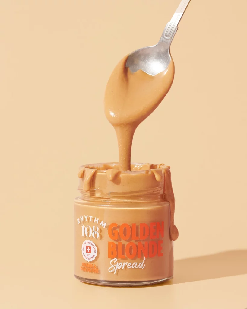
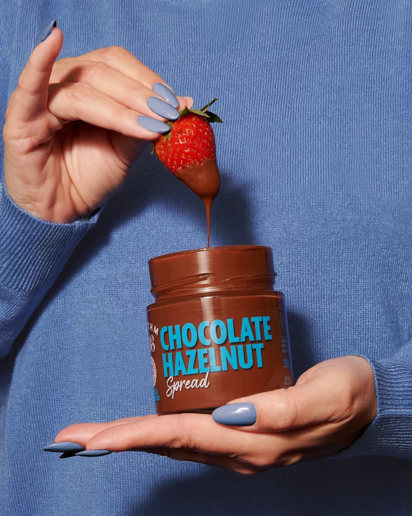
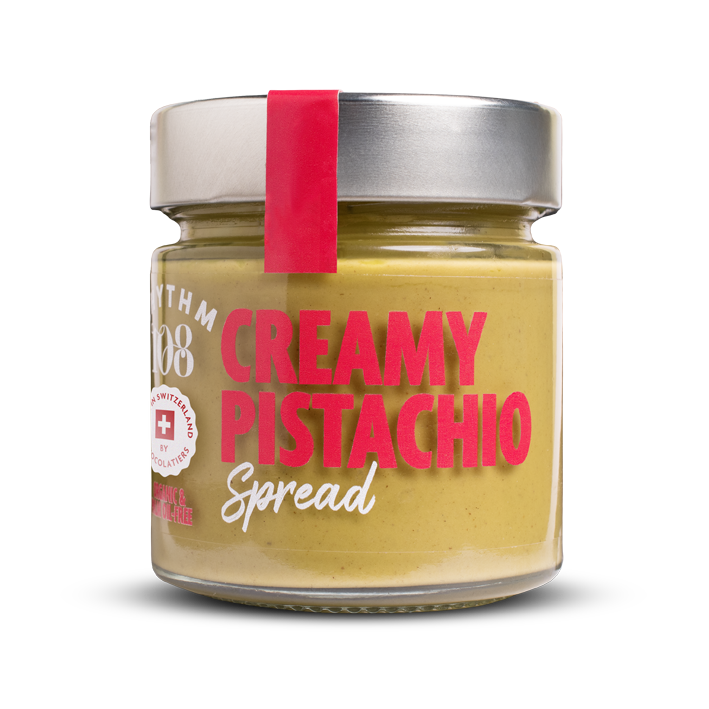
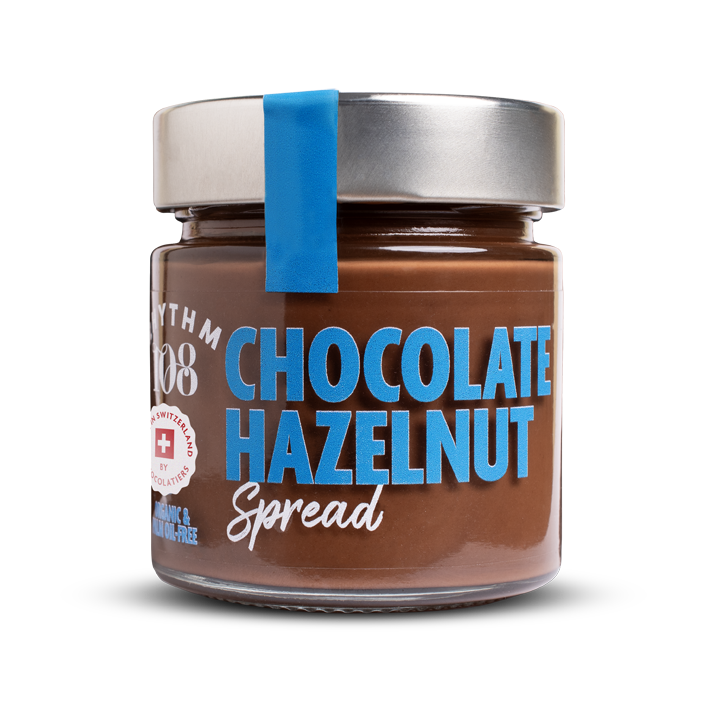
First, the look of the product. Delicate, sweet, colored. The product itself already reflects the brand’s identity: vegan, organic, palm oil-free. Their delicate colors had to be the hero.
In terms of identity, nothing more is needed.
The choice was made to add only a big pop title, bold and handwriting, and let the magic happen.
Seeing the product is also a brand trust element. Customers feels like they already know the product once they have it in hand. And if it makes customer’s mouths water while they’re in the store, so much the better!
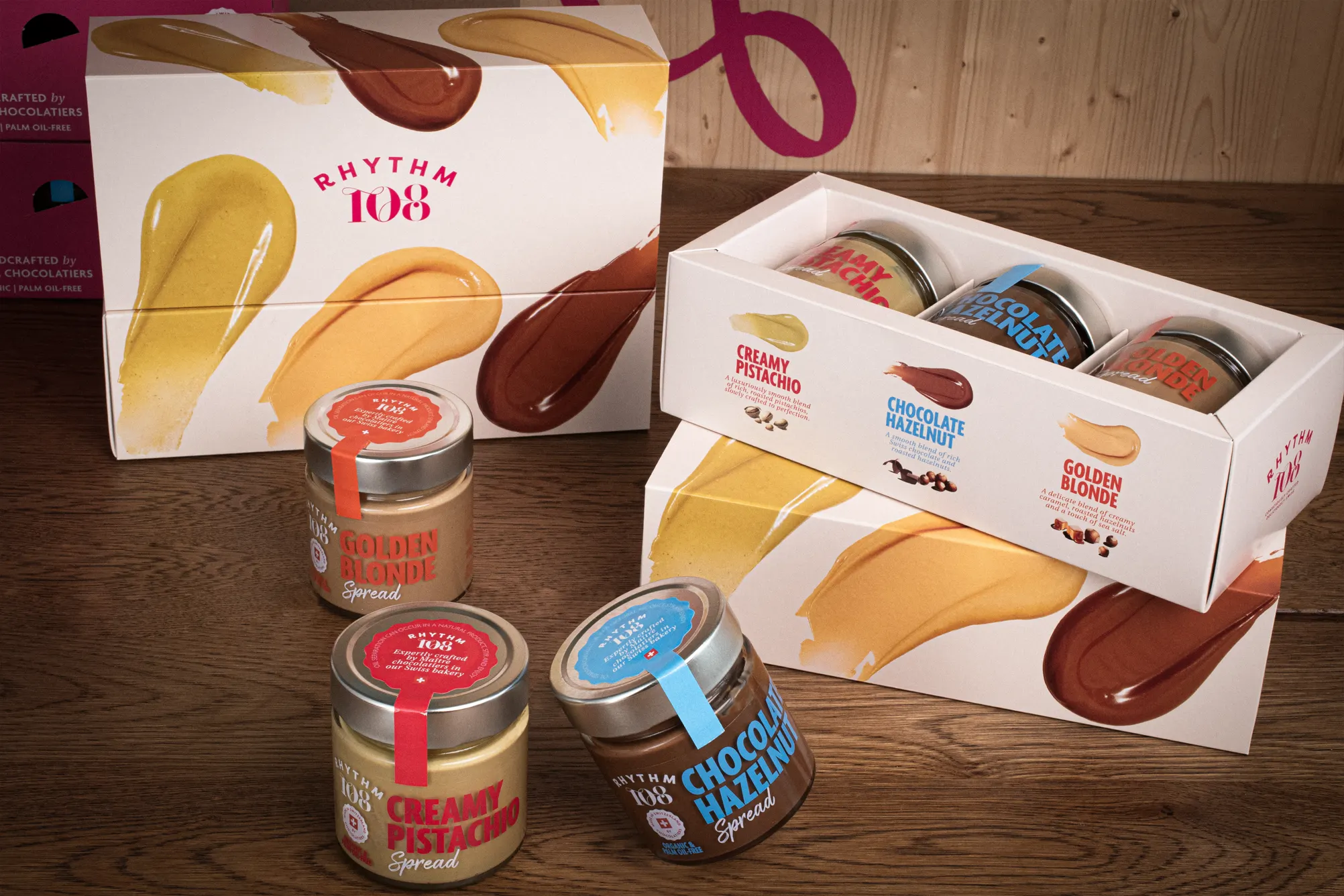
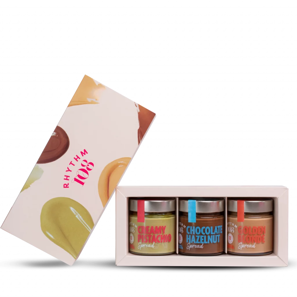
A pop showcase to protect the precious spreads.
This product is a bit different than the other from the brand.
More fun, more pop, it deserved a showcase that reflect the brand’s ambition to propose an already famous product, but vegan and organic, without palm-oil or refined sugar.
That’s bold. That’s Rhythm 108.